Dal loro isolotto del Pacifico, anche in questo frangente i Fedeli dell’Imperatore sono prontissimi a negare l’evidenza, ed a spiegarvi che “sì, è vero, le cose stanno così … ma questa volta è diverso”.
A chi conviene di negare l’evidenza? Conviene a molti, e questi molti formano un gruppo compatto: non c’è nulla, nella vita, che tiene legati e compatti più della paura e della disperazione.
Conviene alle banche globali di investimento, che se non alimentano ogni giorno l’euforia vedono asciugarsi il loro fiume di commissioni.
Conviene al vostro private banker o family banker o consulente, che se non riesce a vendervi i Fondi Comuni di Investimento non ha la capacità di procurarsi un reddito in altro modo.
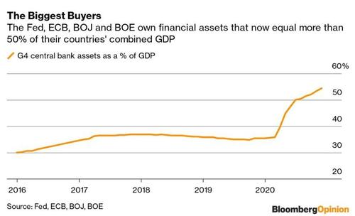
E conviene alle Banche Centrali, che sono sia lucide sia coscienti sia ciniche, e che propinano questa politica monetaria senza freni perché sono arrivate al punto della disperazione, e lo hanno anche superato. Se non agissero così, non saprebbero che fare e non potrebbero fare. Sarebbero fuori dai giochi, e per sempre.
Su questo ultimo punto, ci è possibile fornire un utile approfondimento, per tutti quei lettori del Blog che non si accontentano delle sintesi dei quotidiani e delle frasi da bar sulle Borse, e che pretendono di comprendere più a fondo ciò che sta accadendo intorno a loro ed ai loro soldi investiti. L’occasione ci viene offerta propria dalla Federal Reserve, che in data 21 dicembre 2020, ovvero pochi giorni fa, non ha potuto evitare di constatare che qualche cosa sotto i loro occhi sta accadendo, ed ha pubblicato un documento dal titolo “Che succede alle azioni?” (lo potete trovare qui:“What’s up with stocks?”)
Già nel tono, colloquiale e non accademico, del titolo si coglie l’imbarazzo. Leggendo poi il testo, che trovate anche qui di seguito per vostra facilità, si ha chiara la sensazione che:
La Federal Reserve è a disagio nel trattare questo argomento
La Federal Reserve è a disagio ma è al tempo stesso obbligata ad affrontare questo argomento
La Federal Reserve non ha compreso il perché succede ciò che sta succedendo.
Recce’d rinvia il puntuale approfondimento che seguirà, e lo rinvia ad uno dei nostri prossimi Longform’d, la serie di documenti di ampie dimensioni che vi abbiamo anticipato attraverso il Blog e che presto si trasformerà in una collana di ricerche che offriremo esclusivamente a pagamento, pagamento giustificato del fatto che siamo i soli ad offrire analisi di questo taglio e qualità. Decideremo noi, più avanti, se regalare al lettore una ennesima volta anche questo Longform’d sulle valutazioni di Borsa, oppure se includerlo nella nuova serie a pagamento.
Vi lasciamo alla lettura, con una precisa indicazione:; se questi temi non li maneggiate con facilità, avete solo due alternative. la prima alternativa è chiedere al private banker, al personal banker, al consulente, al promotore finanziario di spiegarvi (ma bene!) come stanno le cose. la seconda è lasciare del tutto perdere con gli investimento in Borsa.
Ve lo dice (nientemeno che) la Federal Reserve.
DECEMBER 21, 2020
What’s Up with Stocks?
Fernando Duarte
“U.S. stocks are racing toward a second consecutive quarter of dramatic gains, continuing a historic stock-market recovery that few predicted in the depths of the March downturn,” said a September Wall Street Journal article. “The stock market is detached from economic reality. A reckoning is coming,” said the Washington Post. What is going on? In this post, I look not at what stocks have actually done or will do, but at what investors expected should have happened, and what they expect will happen going forward. It turns out that, at least by the particular measure of expectations I consider, investors expected stock returns to be high all along and continue to expect the same in the future.
The Equity Risk Premium, Then and Now
The chart below shows an estimate of the one-year-ahead expected excess return on the S&P 500—the so-called equity risk premium (ERP)—since 1964. The estimate is constructed by taking a weighted average of twenty prominent models of the ERP that are used by practitioners or highlighted in the academic literature. The models use more than one hundred unique variables and a broad array of econometric techniques. (In case you want all the technical details, my 2015 Economic Policy Review article with Carlo Rosa explains the methodology.) The most recent estimate is for June of this year and gives an ERP of 11.3 percent. That’s 1.3 standard deviations higher than the historical mean of 6.3 percent and among the top 5 “spikes” in the chart. (qui l’articolo si riferisce ai primo dei quattro grafici che trovate in basso)
Another big spike occurred around 2013. In a May 2013 post, we argued that the ERP had reached heightened levels. This was strange, since a high ERP is usually observed when the stock market is low—during recessions, crises, or other bad times. But in 2013, although the economy was not all sunshine and rainbows, it was not by any stretch as bad as after the 2008 financial crisis. And yet, the ERP was considerably higher in 2013 than in 2008.
The Evolution of the ERP since 2013
One informative way to understand the ERP is to decompose it into three contributing factors: dividends or earnings that tell us how much cash flow stocks are going to produce, risk-free interest rates that tell us how to discount these future payoffs, and a risk-compensation component because—as we all know—stocks are risky. In 2013, we reasoned that the ERP was high mainly because discount rates, as proxied by Treasury yields, were unusually low rather than because of high expected future cash flows or high risk compensation.
What has happened since then? The high ERP—the expectations of high excess returns—did translate into high realized returns, and then some. Between 2013 and June 2020 (the last date available for the ERP estimates), the S&P 500 doubled. To the extent that a high ERP is indeed a good predictor of high returns, the observed behavior of stock prices in the recent past is not a new thing.
Let’s go a bit deeper. The chart below shows in blue the same ERP as the chart above but zooming in to the 2013-2020 period. The red line is the effective federal funds rate. I divide this period into three sub-periods: 2013-2017 (shaded tan), 2018-2019 (shaded green), and 2020 (shaded pink). (qui l’articolo si riferisce al secondo dei quattro grafici che trovate in basso)
Consistent with an improving economy, the ERP declined steadily between 2013 and 2017. Part of the reason is that interest rates were expected to increase (and they did). Another reason is shown in the next chart, where I plot in blue the realized growth rate of real earnings for the S&P 500 and in red the year-over-year change in its expected earnings per share (EPS). By and large, realizations track expectations rather well (the two lines are plotted so that the expectations in red are for the same period as the realizations in blue). Unlike the unidirectional interest rates, here the story is more nuanced. Expectations of EPS through 2016 were declining, contributing to a lower ERP. But from mid-2016 to the end of 2017, they were increasing, pushing the ERP up. Turns out that the opposing forces of higher interest rates and higher EPS kept the ERP more or less constant in 2016-2017. (qui l’articolo si riferisce al terzo dei quattro grafici che trovate in basso)
Once 2018 arrived, expectations of EPS began dropping while interest rates only started declining a year later. This combination produced the relatively low ERP for 2018. Declining expectations for EPS continued to exert negative pressure on the ERP in 2019, but this time interest rates declined enough to push the ERP higher. So even before the COVID pandemic started, the ERP was well on its way up. In 2020, the ERP shot up. Fast. Expectations of EPS, already on their way down, fell off a cliff. But interest rates dropped. A quick back-of-the-envelope calculation suggests that these two opposing forces cannot fully explain the 2020 increase in the ERP. This suggests that a large portion of the increase in the ERP is coming from an increase in risk compensation.
Different Models Disagree, but Not That Much
Is there agreement between the twenty models we examine? The next chart shows the cross-sectional standard deviation of ERP estimates across models. Since 2013, this standard deviation has been among the lowest in our sample, indicating that the dispersion of estimates across models was modest relative to other episodes. Everything else equal, a lower standard deviation provides higher confidence in our estimate, as it means that many of the models are pointing in the same direction. The jump in 2016 and the higher levels since then (higher compared to 2013-2015) are due to a divergence in estimates from models that emphasize price-to-earnings ratios, which give a lower level for the ERP, and models that emphasize recent past returns, which tend to give higher estimates. For example, Shiller’s CAPE, based on price-to-earnings ratios, implies that the ERP (as measured by the inverse of CAPE) declined much more between 2016 and 2018 than the ERP shown in this post. In fact, the CAPE-based ERP is currently significantly below its historical mean. ((qui l’articolo si riferisce ai quarto dei quattro grafici che trovate in basso)
Conclusion
Despite some fluctuations, the first principal component of twenty models of the equity premium has persistently signaled expectations of high excess stock returns since 2013. These high expectations have been validated, with stocks soaring during the period. Going forward, the models still indicate that investors expect high returns despite the recent weakening of earnings expectations. But beware! Some of the most recent increases in the equity premium are likely explained by an increase in risk compensation. And, of course, investor expectations can always turn out to be wrong.